
After months of creative silence, Jackinna is back on the internet, and she has things to say about beige.
I recently fell down a rabbit hole of old photos. Not my own, just the internet’s collective archive of how things used to look. And I noticed something that I genuinely cannot stop thinking about.
Everything was so much more colorful before.
Listen to this story
Short on time? Here is a 4 minute summary in English.
AI narrated. Read at a slightly slower pace, so it’s easier to follow if English isn’t your first language.
Not metaphorically. Literally. The streets, the malls, the kitchens, the clothes, the cars. All of it. Saturated, chaotic, alive. And somewhere along the way we just… turned the brightness down on the whole world and nodded like that was progress.
Cars used to come in turquoise, cherry red, canary yellow. Now the bestselling colors are white, black and silver. We are driving around in the visual equivalent of a spreadsheet. Shopping malls used to have neon signs, fountains, arcades and people in printed shirts who had clearly never heard the word “neutral.” Now they are grey corridors with a Uniqlo, an H&M and one plastic plant.
So let’s talk about it.
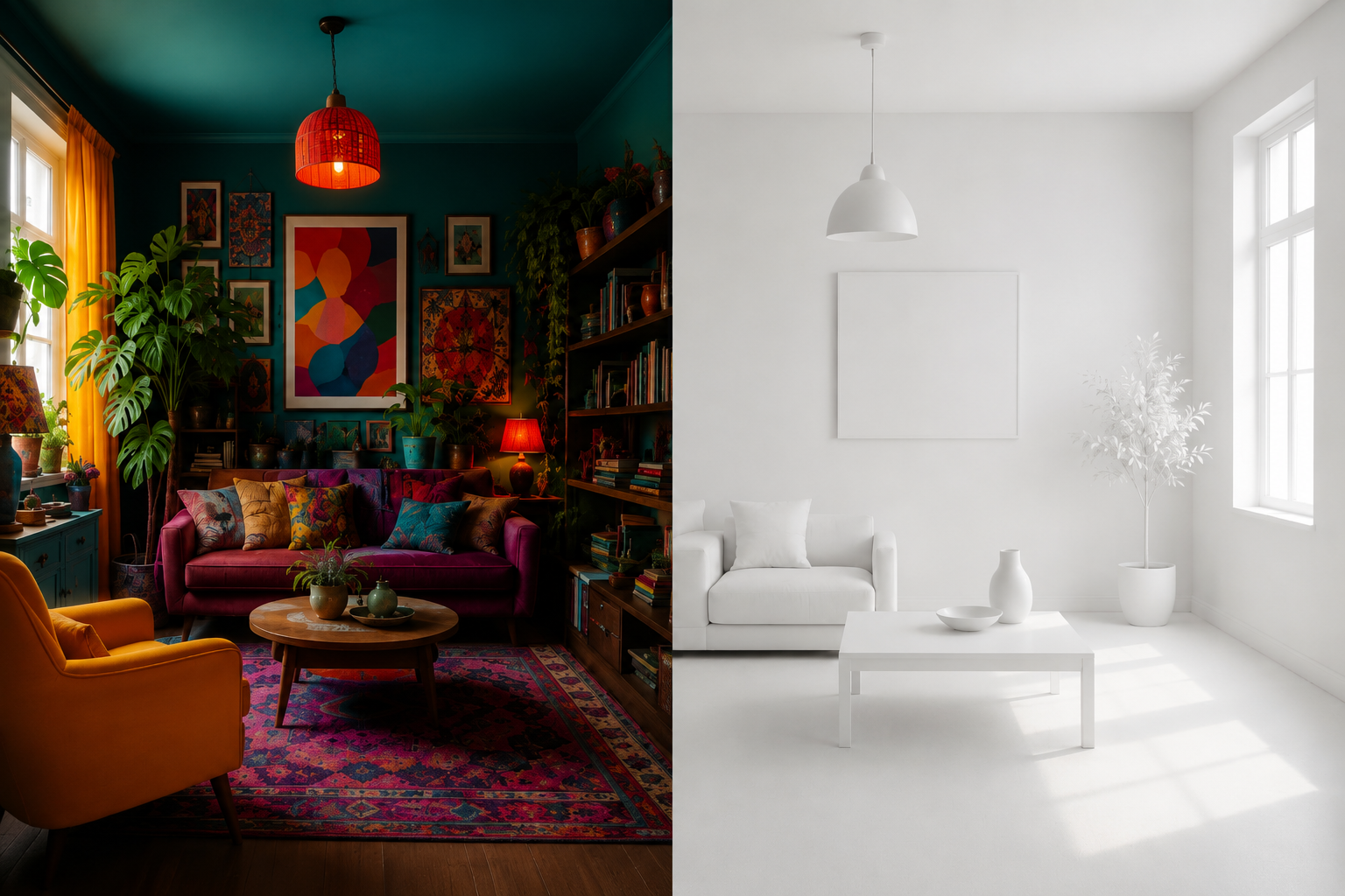
Picture a teenager’s bedroom from the 70s. Beatles poster on the wall. Jimi Hendrix next to it. Or the 80s, with Bon Jovi and Duran Duran. A room so colorful it practically argued with you.
Now picture a bedroom that’s getting thousands of likes on Instagram right now. White linen. Grey headboard. Two black and white prints in matching frames. One yellow throw pillow on a sea of grey and suddenly it’s a “color moment.” A single orange candle on a white shelf tagged #colorpop. One (1) teal mug. Congratulations, you’ve done it. You’ve added color. The room is still a Scandinavian airport lounge, but now it has feelings.
That cushion is not a color choice. That cushion is a hostage.
Here’s my theory, and I’m sticking to it:
we optimized the color out of everything.
Neutral sells faster. Neutral photographs cleaner. Neutral doesn’t alienate anyone. Neutral works in a grid. When everything became content, everything got desaturated, because bold color is… 🥁 a risk, and the algorithm hates risks.
So we went from “this is my taste and it is chaotic and I love it” to “this will appeal to the broadest possible audience and offend absolutely no one.” We called it sophistication. We called it maturity. We called it good design.
It is, in fact, just fear with better lighting.
Think about your grandmother’s apartment. The wallpaper that had no business being that bold. The curtains in a color that didn’t match anything and didn’t care. The rug, the cushions, the little decorative plates on the wall, all of it screaming: I am here, I have taste, and I refuse to be subtle about it.
Get the fuchsia chair. Hang the posters. Paint the door a color that makes your neighbour raise an eyebrow. Wear the print. Buy the patterned plates. Let your bedroom look like someone actually lives in it, someone with opinions and bad ideas and very specific feelings about color.
At least someone got it right
And then there is Marimekko. A Finnish brand that looked at the world and said: more. Bigger flowers. Bolder stripes. Red that is actually red, not “dusty terracotta.” Blue that means business. Patterns that walk into a room before you do.
They have been doing it since 1951 and they have never once apologized for it. Not when minimalism took over. Not when Nordic design became synonymous with white walls and sad succulents. Not when the whole world decided that the correct aesthetic was “as inoffensive as possible.” Marimekko just kept printing. Kept going bigger. Kept being exactly, aggressively, gloriously themselves.
Which is genuinely impressive when you consider where they’re from. This is Finland we are talking about. A country where the sky is grey for approximately nine months a year, where the national mood could be described as “a lonkero in a quiet kitchen,” and where the unofficial slogan is “could be worse, probably will be.” If anyone had an excuse to embrace beige, it was the Finns. The weather did half the work already.
And yet. Someone in Helsinki in 1951 looked out at all that grey and said: no. Actually, flowers. Giant ones. In red. As if to personally spite the sky.
Nobody looked at a Marimekko print and thought “this could use more neutral.” That was never the point. The point was joy. Loud, unapologetic, deeply committed joy. And somehow, in 2026, that feels almost radical.
The Greyest Day of the Year – How Finns Learned to Love the Gloom
In mid-November, a heavy blanket of grey descends upon Finland, making most people crave southern sunshine. But did you know that Finns have a habit of turning this bleakness into a celebration instead of a complaint? This is The Greyest Day of the Year (Vuoden harmain päivä), which has evolved into a modern, humorous national festival right in the middle of the darkest season.
The world has enough beige corridors. It does not need yours too. The algorithm will survive if you paint your door orange. Your Instagram grid will not collapse if you own something patterned.
And somewhere, underneath all the greige, Jackinna is waiting to see if you’ll finally be someone your grandmother’s wallpaper would be proud of.
Leave a Reply